Collection of posters for the Sydney Paralympic Games
Object No. 2001/84/260
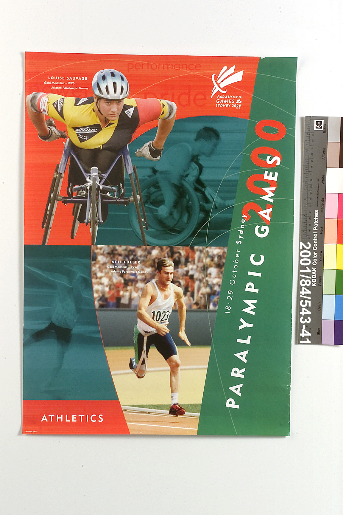
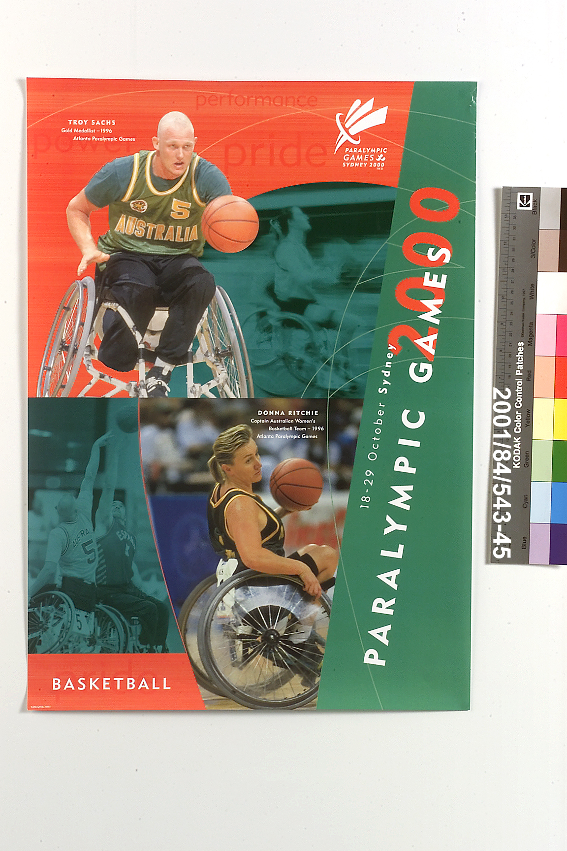
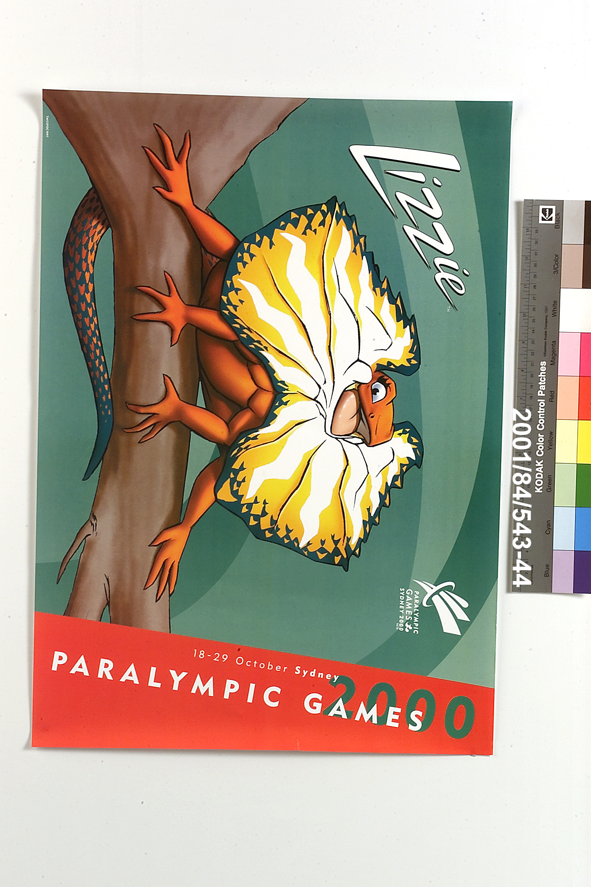
This selection of seven posters was printed in 2000 to promote the coming Sydney Paralympic Games - two posters advertise the Opening and Closing Ceremonies while the remaining five promote the Games themselves. A series of graphic treatments unify the poster designs and link them visually to other official material for the event. Recurring features include the colours, Paralympic red, Paralympic green and Paralympic blue; an angular, geometric typeface; textured backgrounds referring to sport or the Games emblem; and blurred, tinted and angled photographs that symbolised athletic energy at the new millennium. Together, these features reflect the branding package, or kit of parts, that unified most visual elements of the Games. The transition from the Olympic to Paralympic Games became visible in Sydney in late September 2000 when a new branding package redefined the look of the city and competition venues. Developed by Australian company, FHA Image Design, this kit set a new visual tone in Sydney yet retained the same presentation techniques and sense of celebration that characterised the Olympic Games. Flags, banners, fascias, decals and corrals were typical branding fixtures, demarking the fields of play, assisting navigation and coordinating competition venues. From early 1999, FHA Image Design worked in concert with SPOC and the International Paralympic Committee (IPC) to devise a kit that would reuse selected fixtures and graphics from the Olympic Games (the 'Sydney 2000' graphic was a key branding element of both the Olympic and Paralympic Games). Through its moderation, this strategy would reduce waste and costs yet foster a strong and unique Paralympic identity. The Paralympic Look of the Games Program coordinated this strategy and made design drawings of each venue - these illustrated the full extent of branding applications and ensured that the Paralympic Games emblem and Sydney 2000 logo would be visible from all camera angles. Signifying "power, performance and pursuit", the Sydney 2000 Paralympic kit of parts reflected the optimism and aspiration of athletes, and formed a distinct and unified image for the Games. At its centre, an emblem of three surging shapes symbolised the energy of Paralympic athletes and resembled the three-tiered Paralympic torch. Its colours: green, red, blue and black, came directly from the Sydney 2000 Paralympic colour palette - itself derived from the IPC logo. A secondary palette provided highlights and bridged the separate palettes for the Olympic and Paralympic Games. Other defining elements included angled headings; geometric and outlined typefaces; background textures alluding to water, grass, sand and sports equipment; and cropped and blurred photographs of Paralympians. Optimistic statements, such as "success is a choice", encapsulated the Paralympic spirit and embellished posters, pamphlets and documents.
Loading...
Summary
Object Statement
Posters (7), Paralympic Games, Sydney, 2000, paper, designed by the Look of the Games Committee, Sydney c. 2000
Physical Description
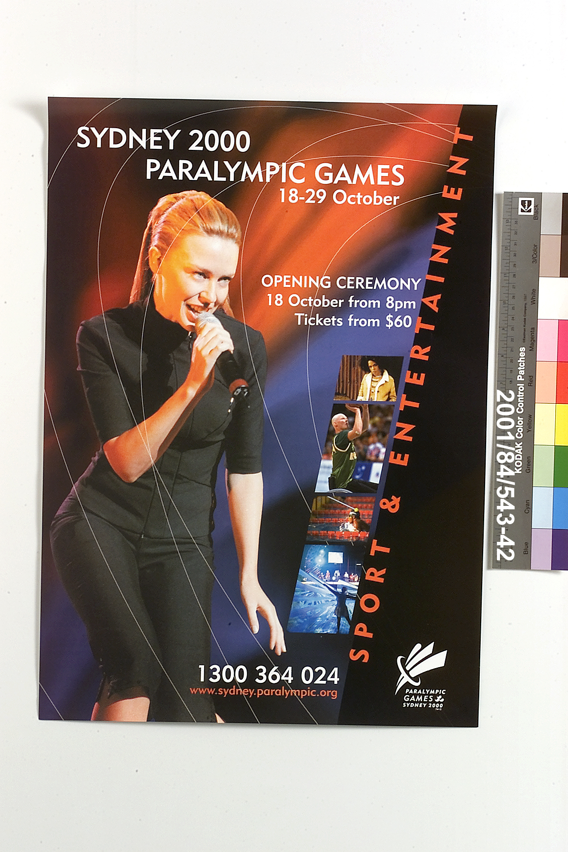
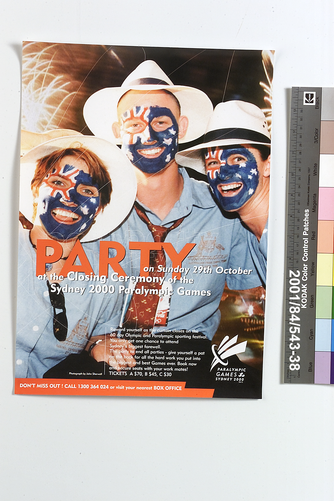
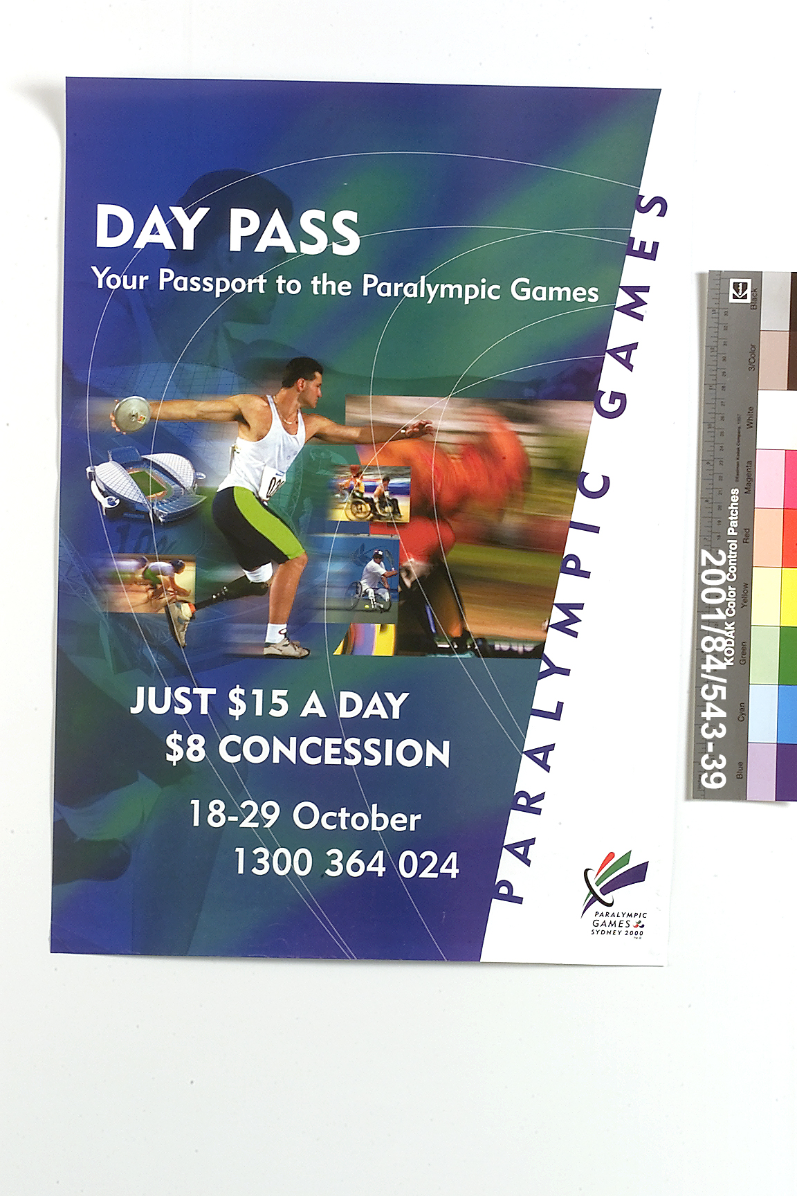
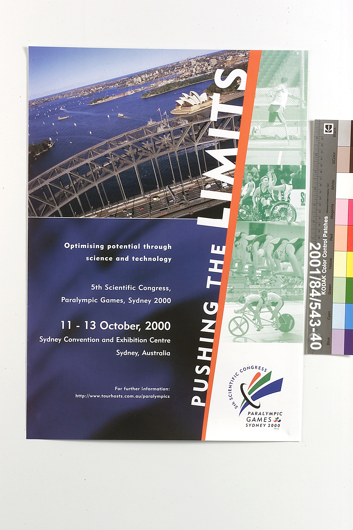
Posters (7), Paralympic Games, Sydney, 2000, paper, designed by the Look of the Games Committee, Sydney c. 2000 Posters, 7, gloss paper. Each publicises the Paralympic Games. One of the posters advertises the Opening Ceremony and features a photograph of Kylie Minogue another advertises the Closing Ceremony. There is a poster advertising Day Passes to the Games and another publicising the 5th Scientific Congress of the Paralympic Games. Two posters feature Paralympic athletes and are general publicity posters for the Paralympic Games. The final poster features the Paralympic mascot Lizzie.
PRODUCTION
Notes
A series of graphic treatments unify the poster designs and link them visually to other official material for the Games. Recurring features include the colours, Paralympic red, Paralympic green and Paralympic blue; an angular, geometric typeface; textured backgrounds referring to sport or the Games emblem; and blurred, tinted and angled photographs that symbolised athletic energy at the new millennium. Together, these reflect the branding package, or kit of parts, that unified most visual elements of the Games. The package was developed in 1999 by Australian company, FHA Image Design. This selection of seven posters was printed in 2000 to promote the coming Sydney 2000 Paralympic Games - two posters advertise the Opening and Closing Ceremonies while the remaining five posters promote the Games themselves.
HISTORY
Notes
Though these posters have not been used, they are examples of those that promoted the coming Paralympic Games. Made for and owned by the Sydney Paralympic Organising Committee and donated to the Powerhouse Museum after use at the Games.
SOURCE
Credit Line
Part of the Sydney 2000 Games Collection. Gift of the New South Wales Government, 2001
Acquisition Date
5 October 2001

Copyright for the above image is held by the Powerhouse and may be subject to third-party copyright restrictions. Please submit an Image Licensing Enquiry for information regarding reproduction, copyright and fees. Text is released under Attribution-Non Commercial-No Derivative licence.
Image Licensing Enquiry
Object Enquiry